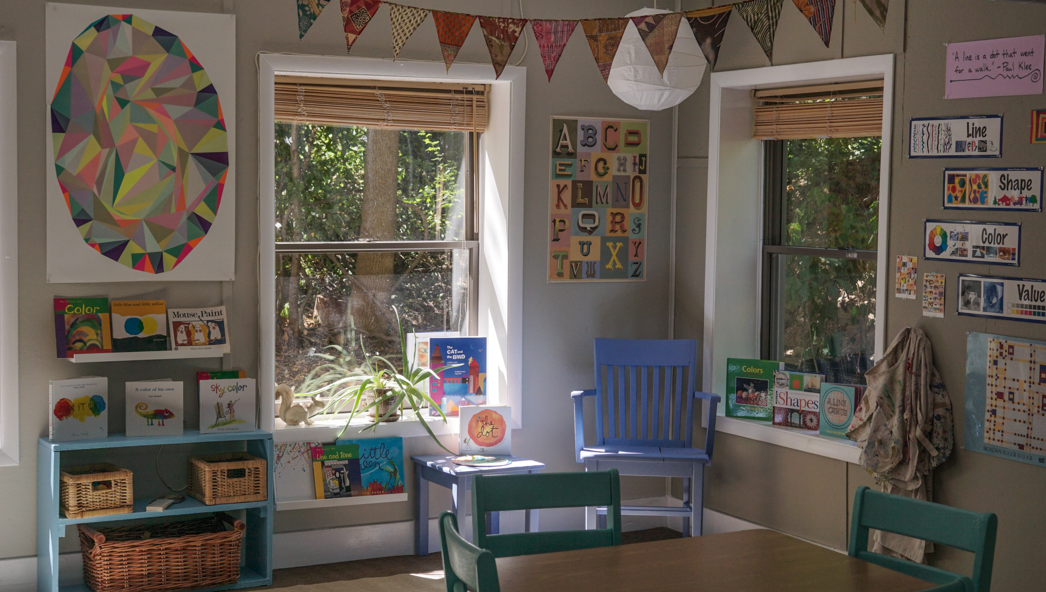
Art at Miquon
There have been quite a few changes in the art room since last spring: new teacher, new room layout, new, well, it’s a new year! You can also follow what is going on in the art room at instagram.com/miquon.art
Our 3rd to 6th grade artists started the year by becoming acquainted with the art room and personalizing their sketch books.
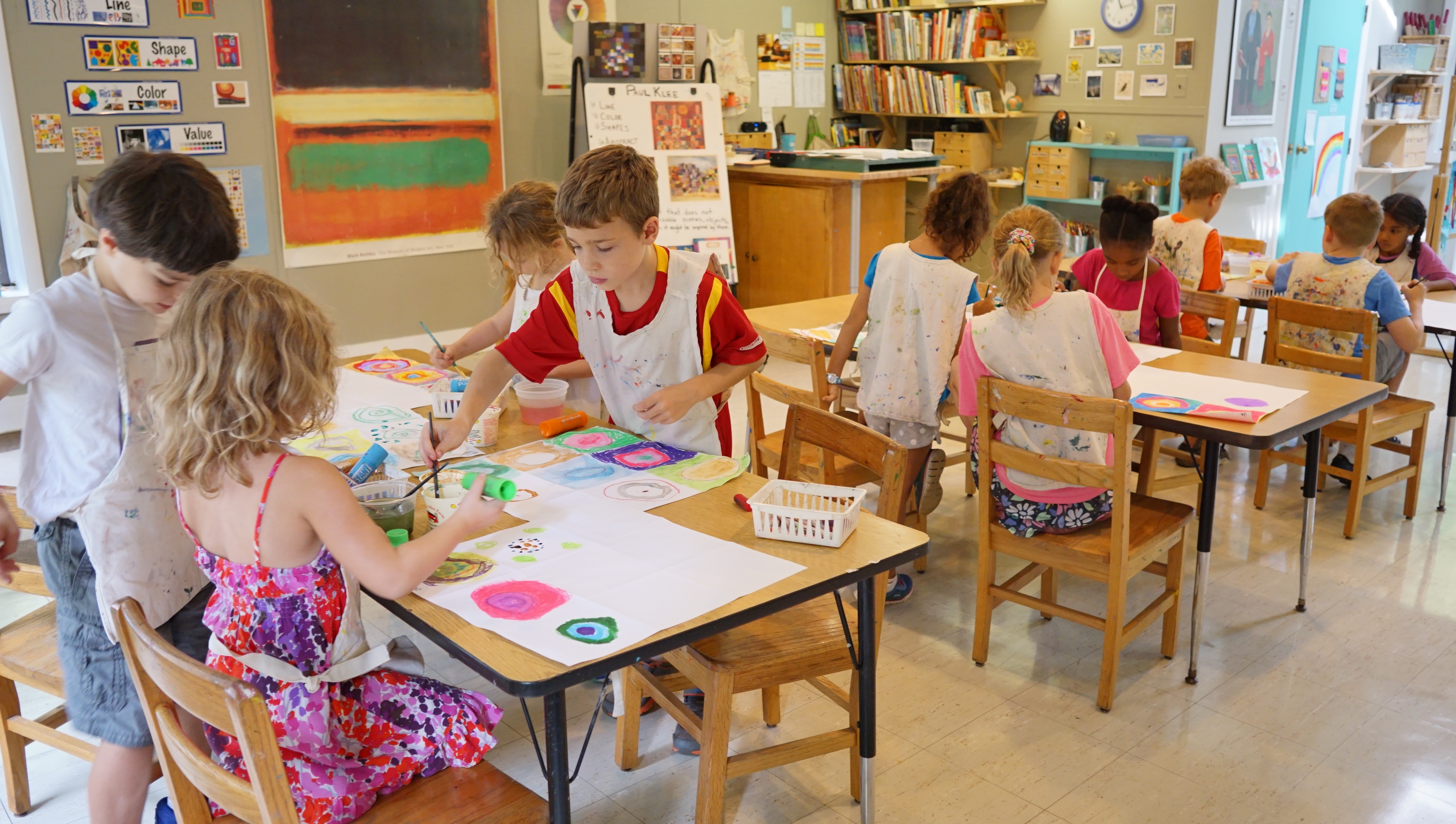
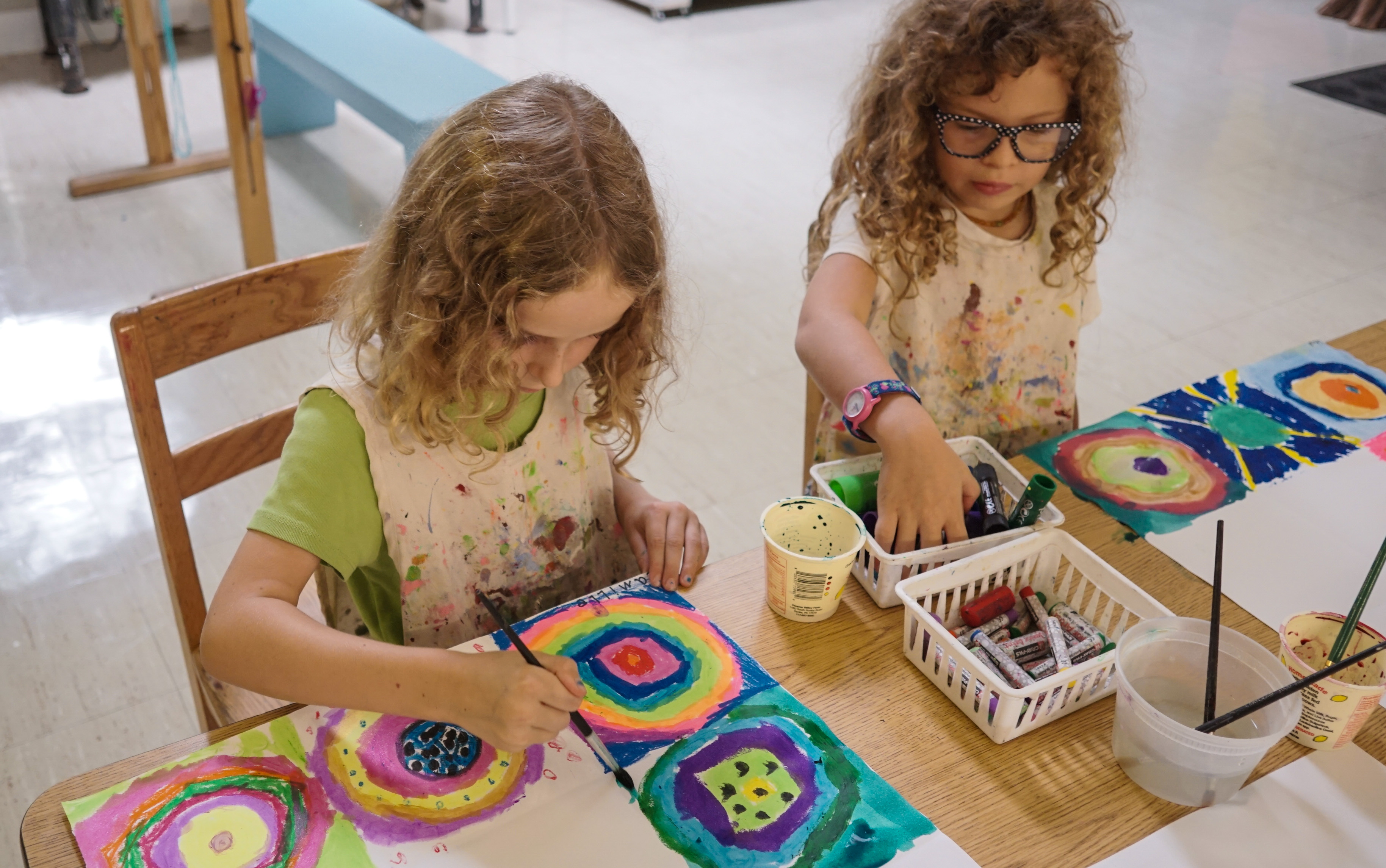
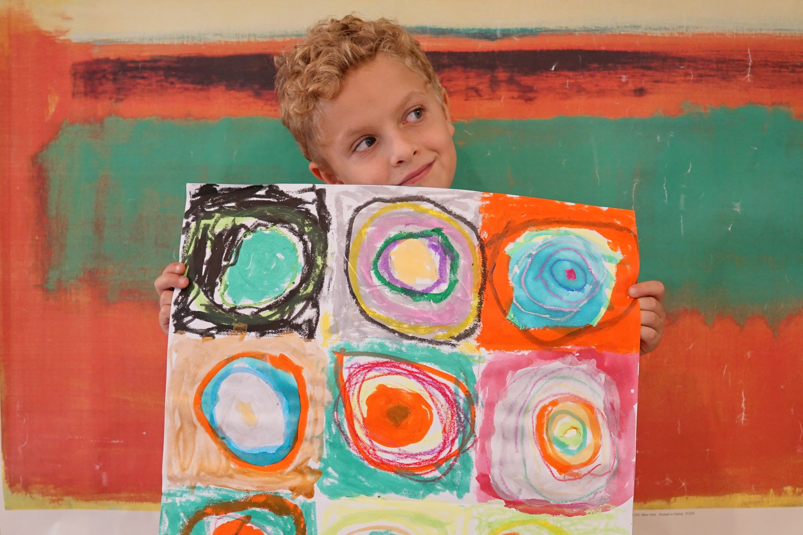
Kindergarten and 1st/2nd started very simply—with just a dot. We first read “The Dot” by Peter H. Reynolds, in which a young girl named Vashti doesn’t think of herself as an artist until her teacher encourages her to make a dot and see where it takes her. We then talked about an important artist whose works were based on similarly-simple elements: Wassily Kandinsky. We looked at his painting “Color Study, Squares with Concentric Circles,” and from there we were inspired to create our own beautiful dots and circles. Some of our dots were created by not making a dot at all! The next class we read “Little Blue and Little Yellow” by Leo Lionni, and finished our works by challenging ourselves to see what colors we could make.
“A line is a dot that went for a walk.” – Paul Klee
…and that is exactly where we started our year in the art room.
I wanted to be sure that we all have a shared vocabulary for what we are going to be exploring and creating throughout the year, and the many works of Paul Klee serve as wonderful examples upon which to base our discussions and explorations of the Elements of Art—Line, Shape, Form, Color, Value, Texture, Space.
Now that K-2nd grade had explored dots, we began to—artistically-speaking—go for a walk. The entire school, from Nursery to 6th grade, was introduced to Paul Klee, and each group examined different styles and works from Klee’s life as an artist.
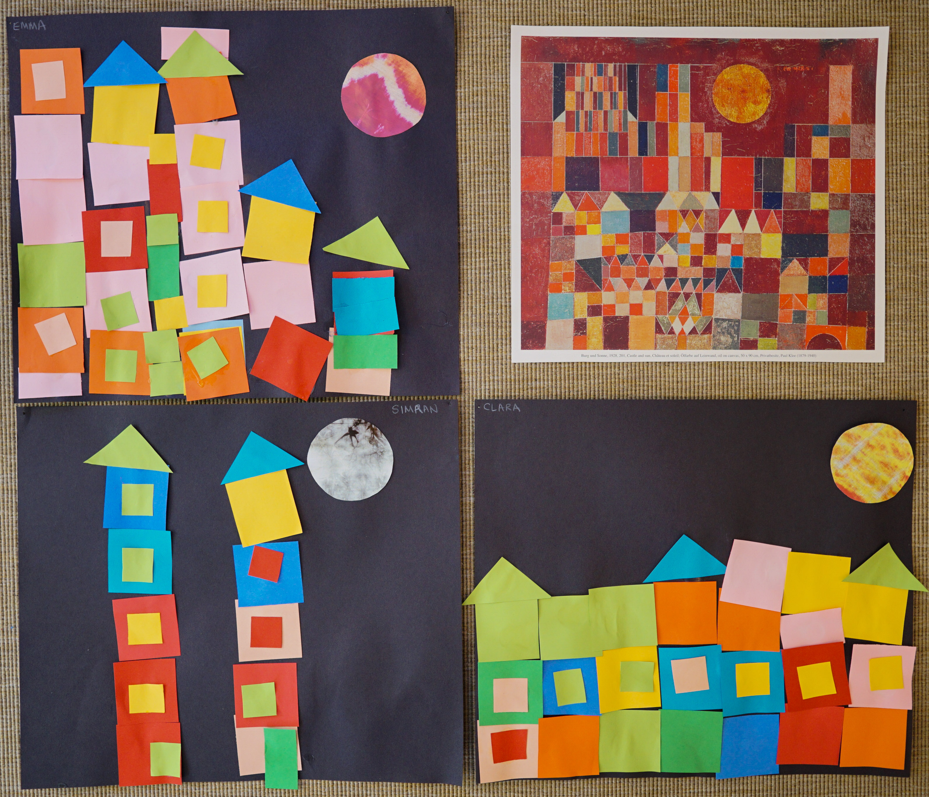
With the Nursery through 2nd grade, we started our study of Paul Klee by reading “The Cat and the Bird” by Géraldine Elschner— a story inspired by Klee’s whimsical painting “Cat and Bird.” The brilliantly colored illustrations were inspired by Klee’s work: they were influenced by his love of color and use of shapes and line. From here, Nursery took a closer look at Klee’s “Castle and Sun” painting, finding the shapes and colors within it. They then had an opportunity to create there own castles, cities, and villages from a variety of colorful shapes.
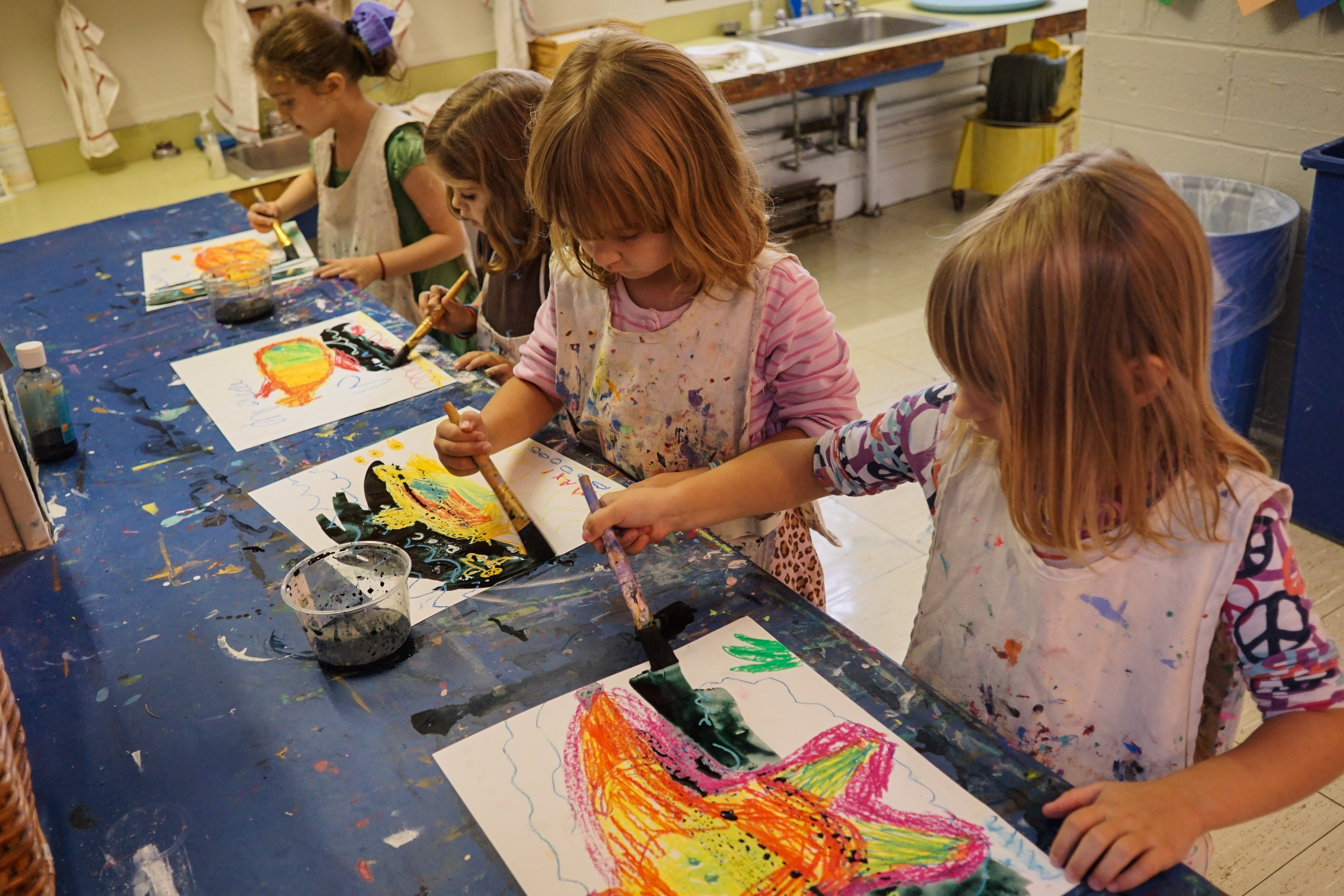
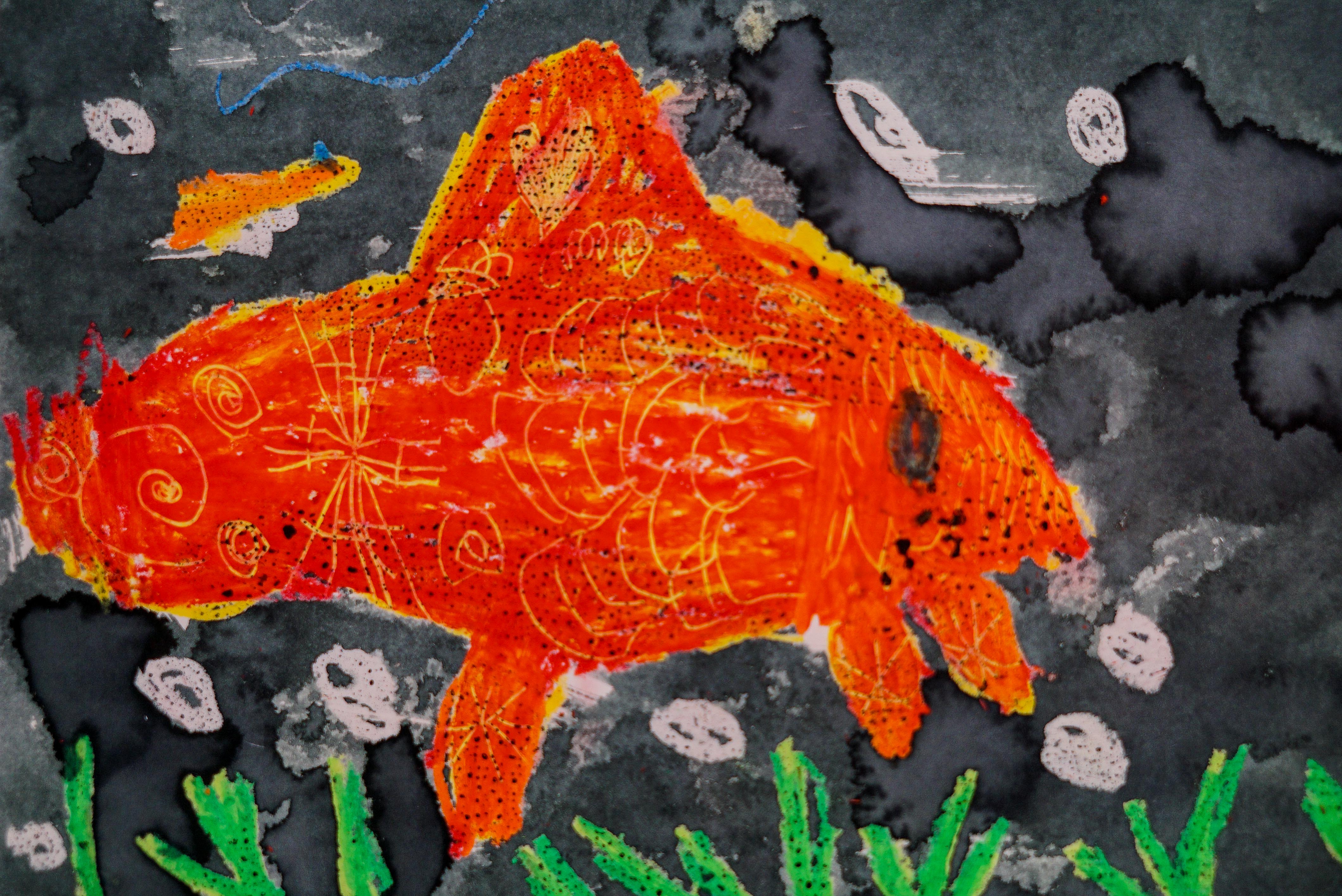
Kindergarten looked at a few of Klee’s paintings of fish, taking care to notice the lines, colors, shapes, texture and the use of black background to make the images pop! Working with oil pastel, they experimented with mixing colors, overlapping colors, and scratching into the layers to create line and texture. Using black water color over their entire piece, they could see how the oil in the pastel created a resist and pushed away the watery paint.
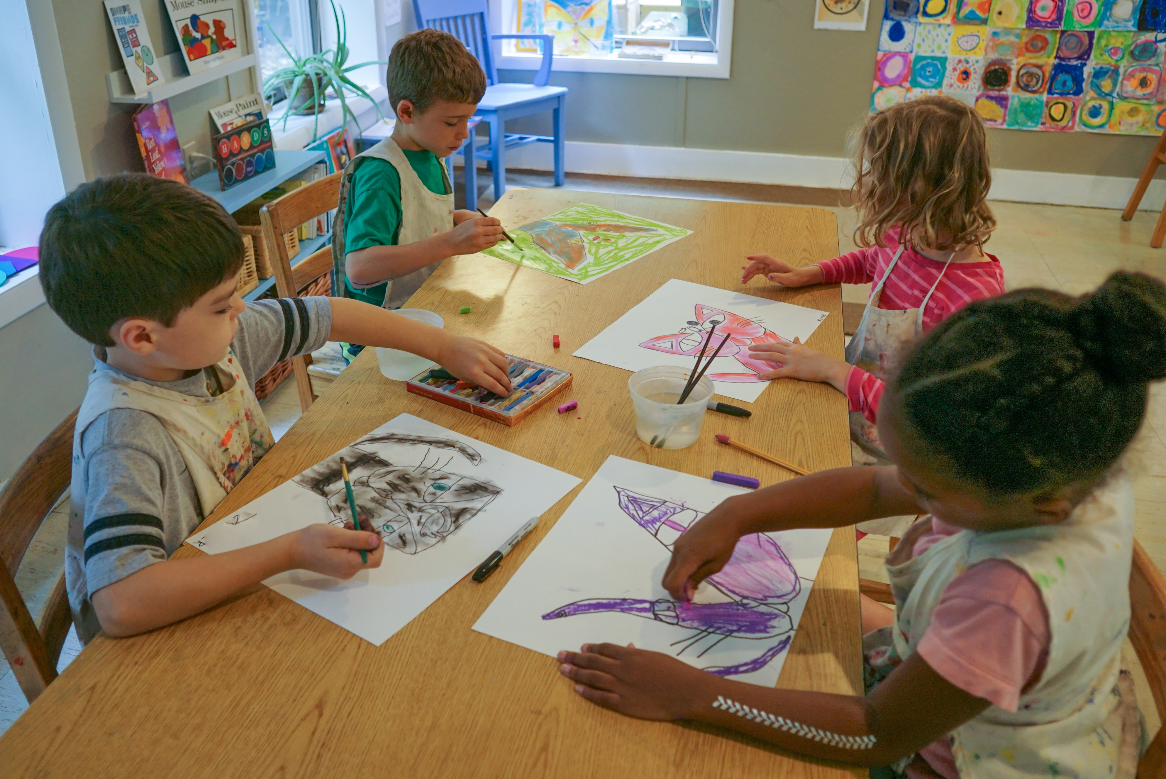
With the 1st/2nd grade, we took a closer look at Paul Klee’s painting “Cat and Bird” that had inspired the book that we had just read. We noticed that Klee’s choices in the painting gave us clues: the colors; the shapes. We talked about the cat’s heart-shaped nose as a clue that let us know what the cat desired, and that both its nose and simply-drawn bird on top of the cat’s head are the same red—the cat must be thinking about a bird! We continued discussing the colors Klee choose and how they made us feel. The term Expressionism was introduced, and we talked about what other things a cat might be thinking as we set off to make our very own cats. We used Klee-inspired simple shapes and beautiful colors created from chalk pastel, water and a paintbrush to help tell our cats’ stories.
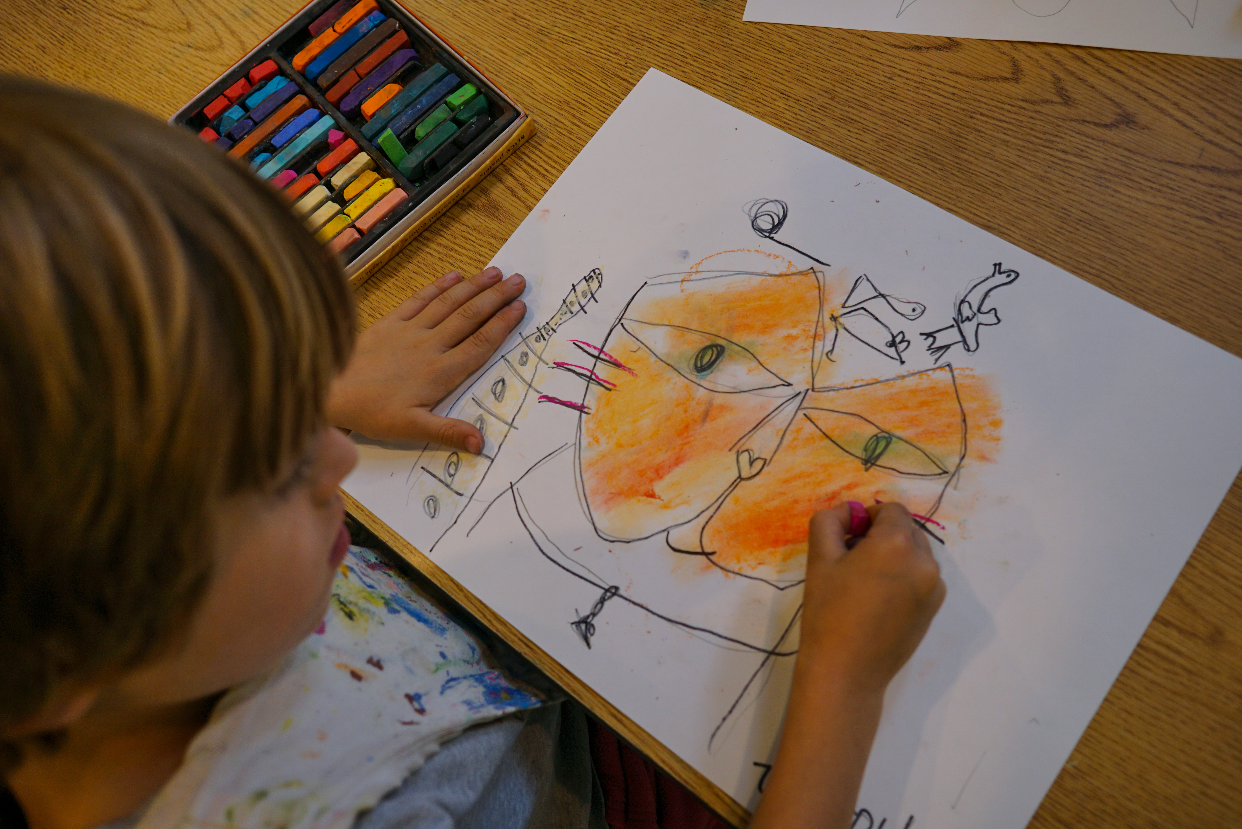

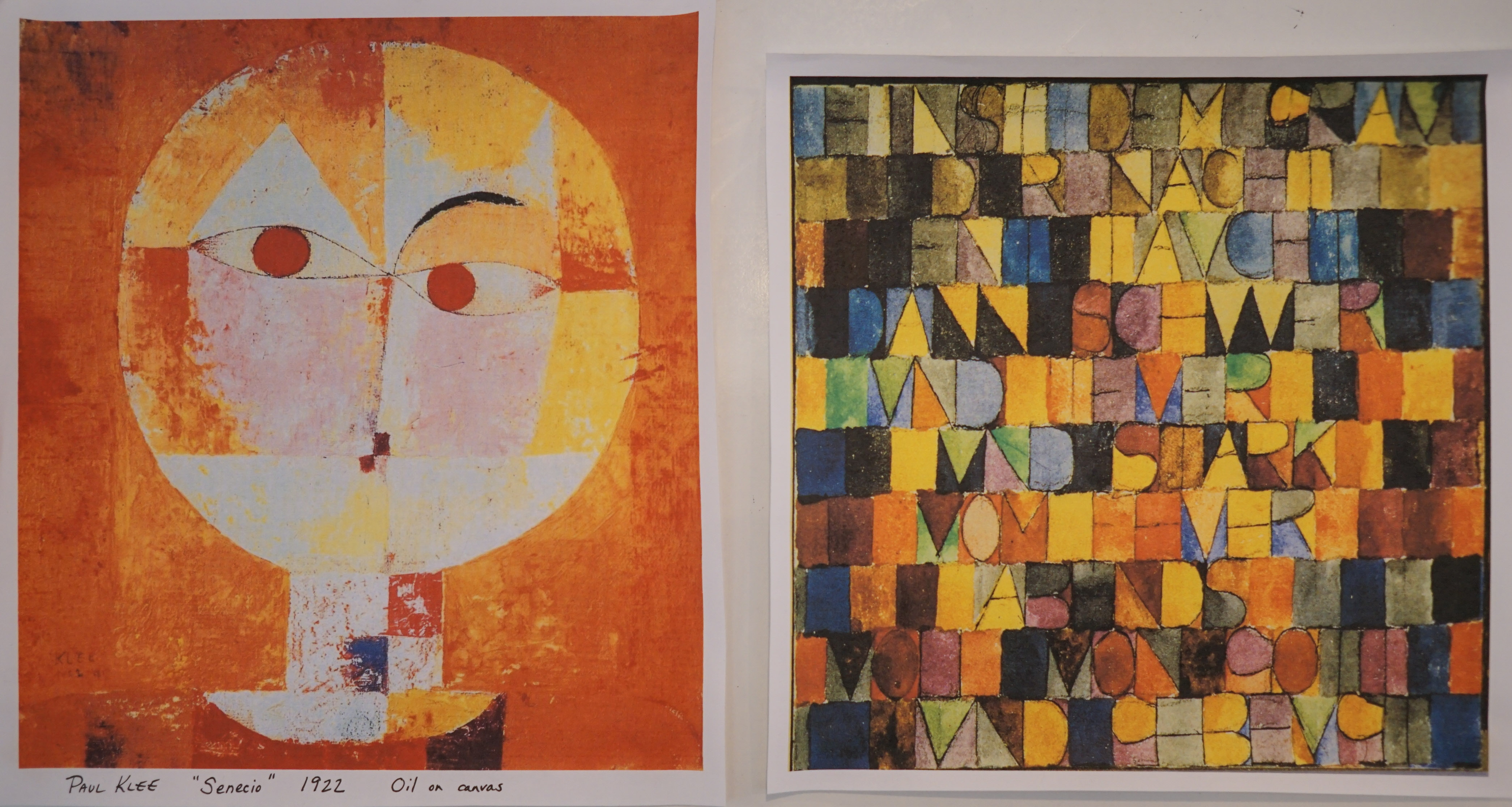
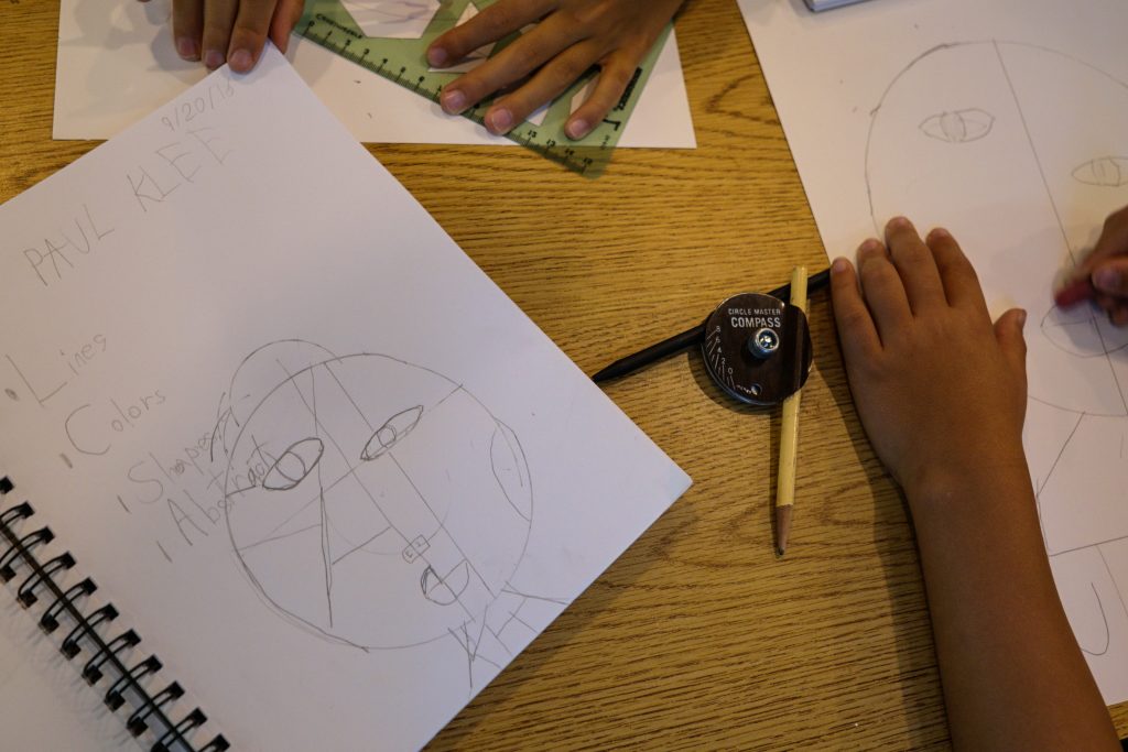
3rd-6th grade were introduced to Paul Klee by reading “Getting to know Paul Klee” by Mike Venezia. With the 3rd/4th we focused on two of Klee’s works: “Senecio” and “Du Gris de la Nuit Surgit Soudain.” After discussing abstract art, noting the importance of the simple lines, colors, shapes and textures that Klee used in his works, the 3rd/4th graders set off to make their own abstract portraits using rulers, compasses and stencils to help create their images. Inspired by Klee’s love of using text to create shapes in his works, each artist incorporated their name into their finished piece. Color was added with crayon and oil pastel: artists explored blending colors, how the amount of pressure applied changes the tone/feel of the color, and overlapping colors that could then be scratched-into. Water color was used to finish the piece.


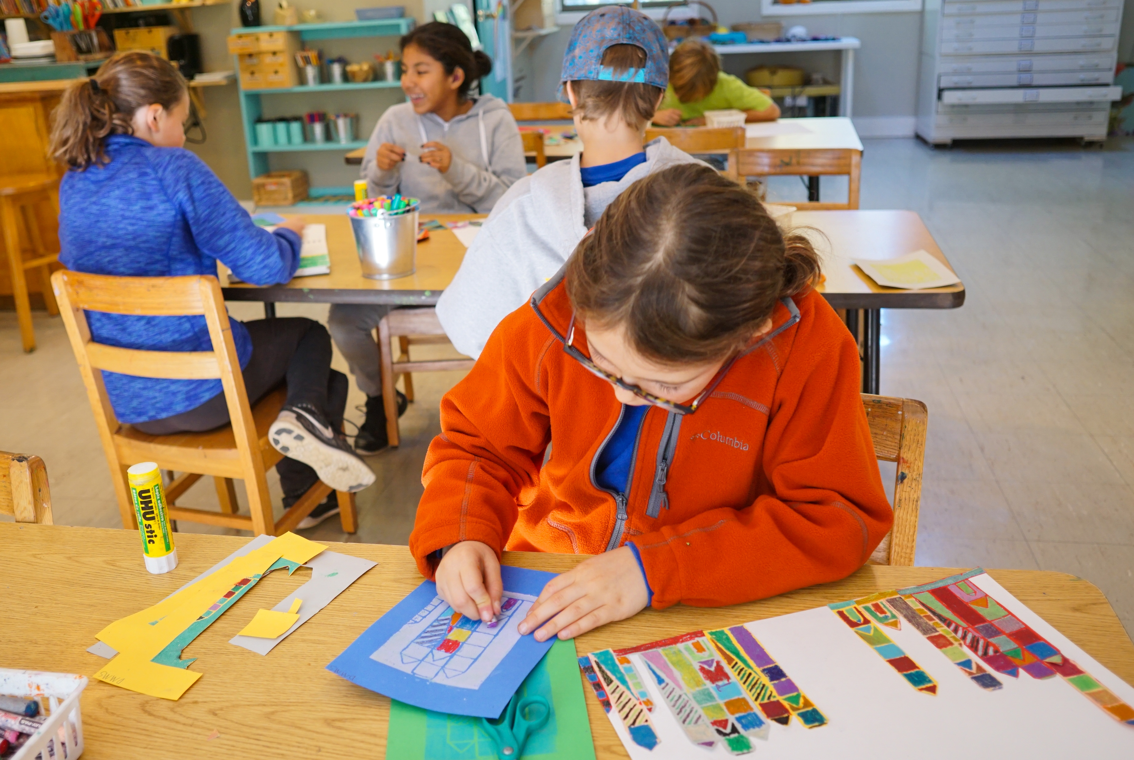
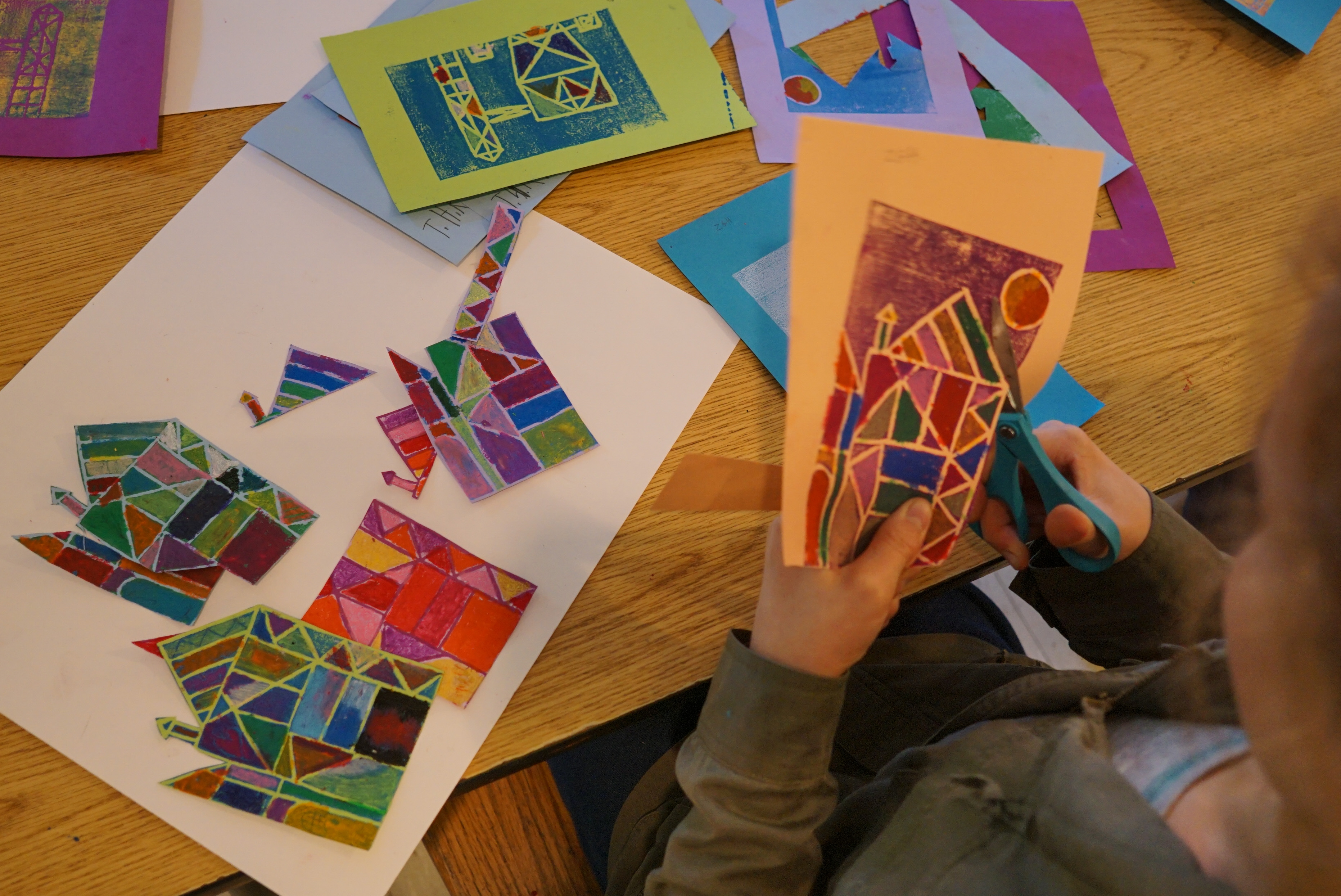
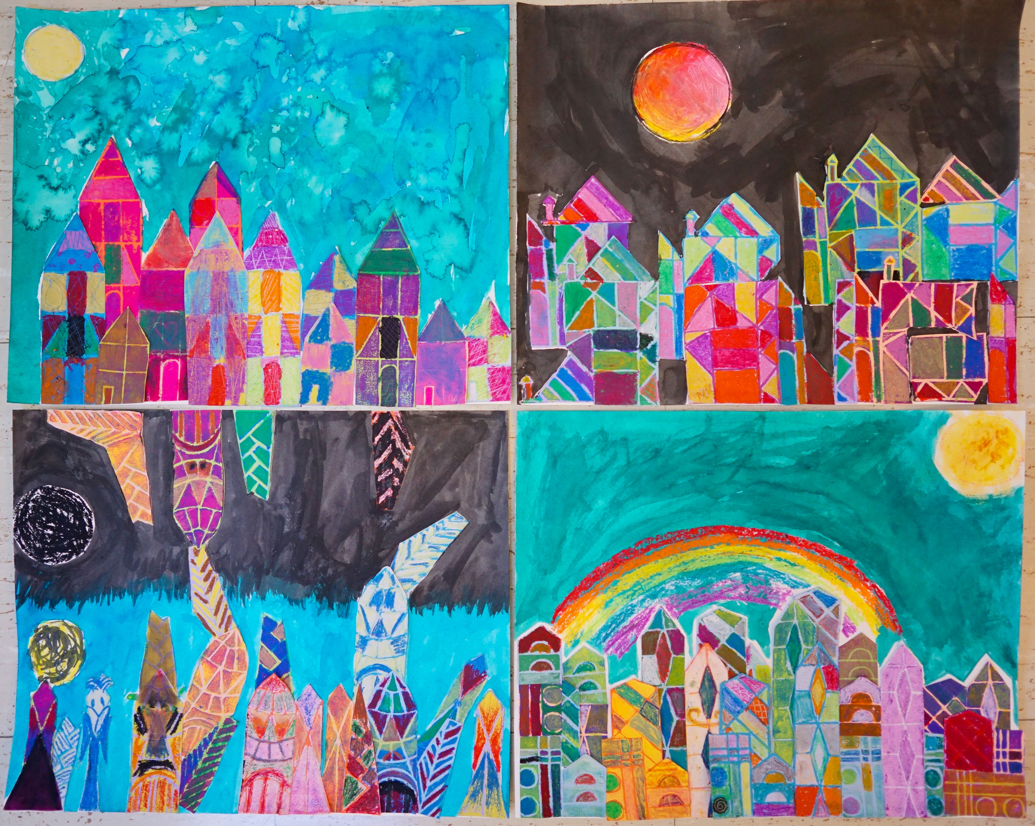
The 5th/6th focused their study on the evolution of Klee’s paintings of buildings, noting how over time they became more abstract. From here—using rulers and simple shapes—they began creating their own cityscapes. These drawings were then transferred onto a foam printing plate. Multiple prints were made, and artists experimented with paper and ink choices. Once the prints were dry, additional color and texture were added to their printed designs using oil pastels, crayons and scratching tools. Once their incredible array of colorful buildings was done, they they cut each of them out in different ways and configured them as one final cityscape or castle.
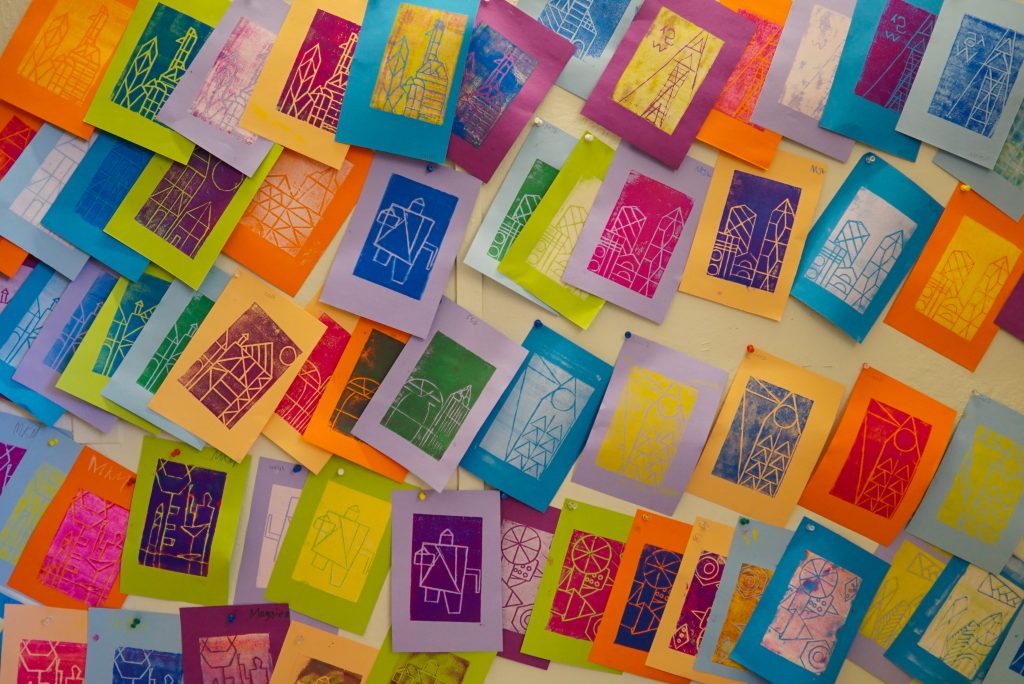
Students throughout this study have been excited to see the other class’ artworks, and to learn what Klee works inspired them.
Since finishing our whole-school unit on Paul Klee, the individual classes have begun branching off in different artistic directions: color study, observational drawings both from still life and nature with an emphasis on shading and perspective, and more.